IN PRINT
/
IN PRINT /
A legacy newspaper, rebuilt for a changing audience.
As Creative Director, I led visual direction across seven Press & Journal publications and their digital channels, evolving a long-running local newspaper into a clearer, more contemporary editorial system while protecting the authority and familiarity of the brand.
PRESS & JOURNAL PUBLICATIONS
Creative Direction / Editorial Design / Publication SystemsTHE REDESIGN
from noise TO HIERARCHYThe redesign wasn’t about making a newspaper look like a magazine. It was about creating hierarchy strong enough to let the journalism lead.
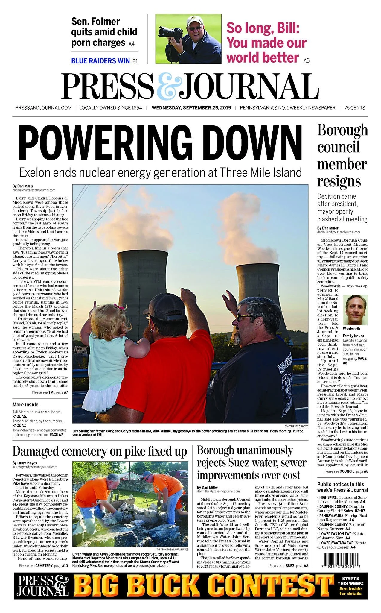
AFTER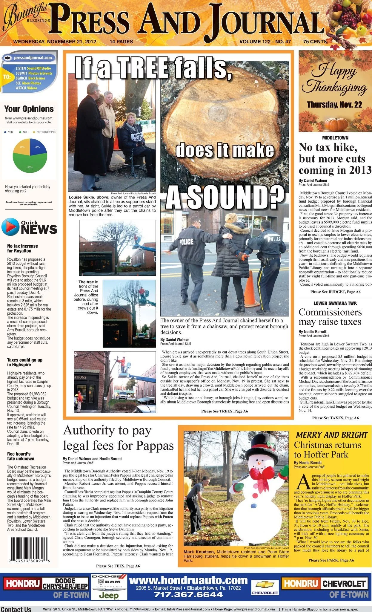
BEFORETHE SYSTEM
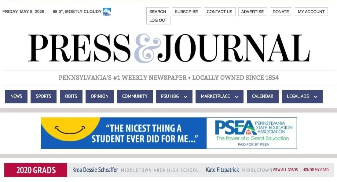
BUILT TO FLEX 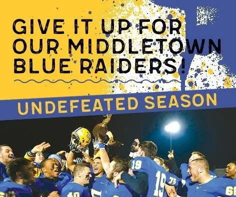

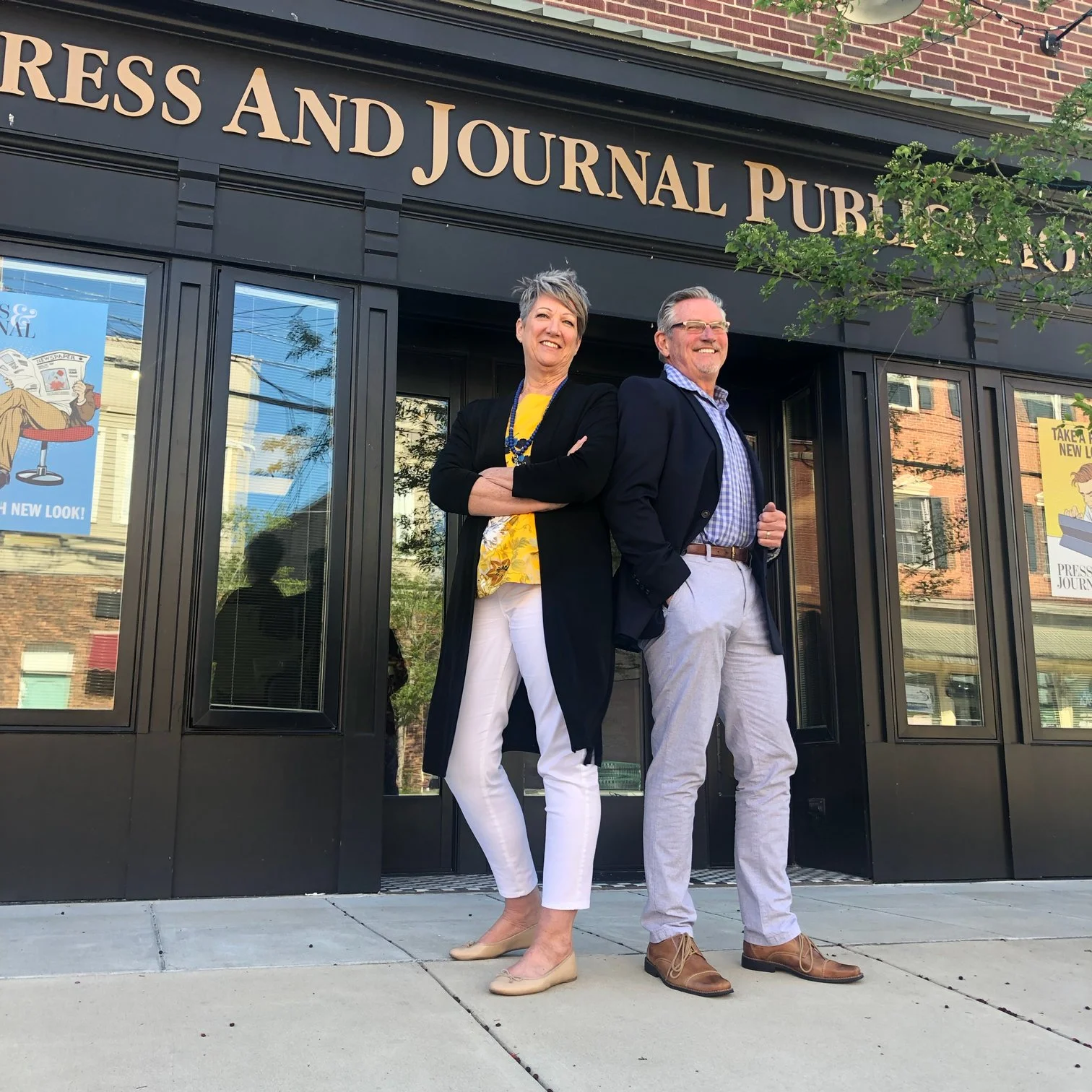
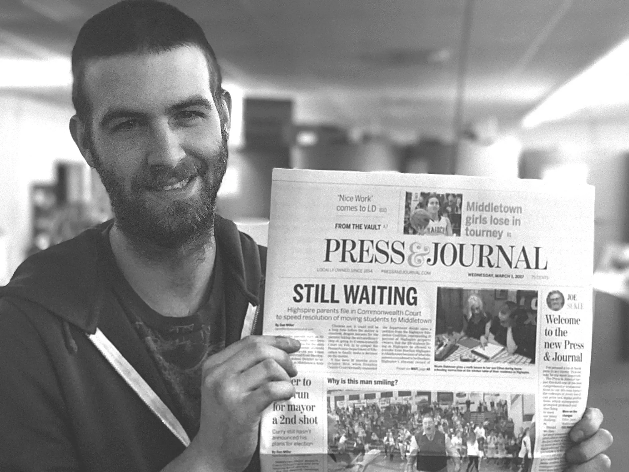
Photography: Julianna Sukle
The system had to work every week, across breaking news, community reporting, photography, advertising and special coverage. Structure created consistency; flexibility allowed the news to determine the page.
THE EXCEPTION
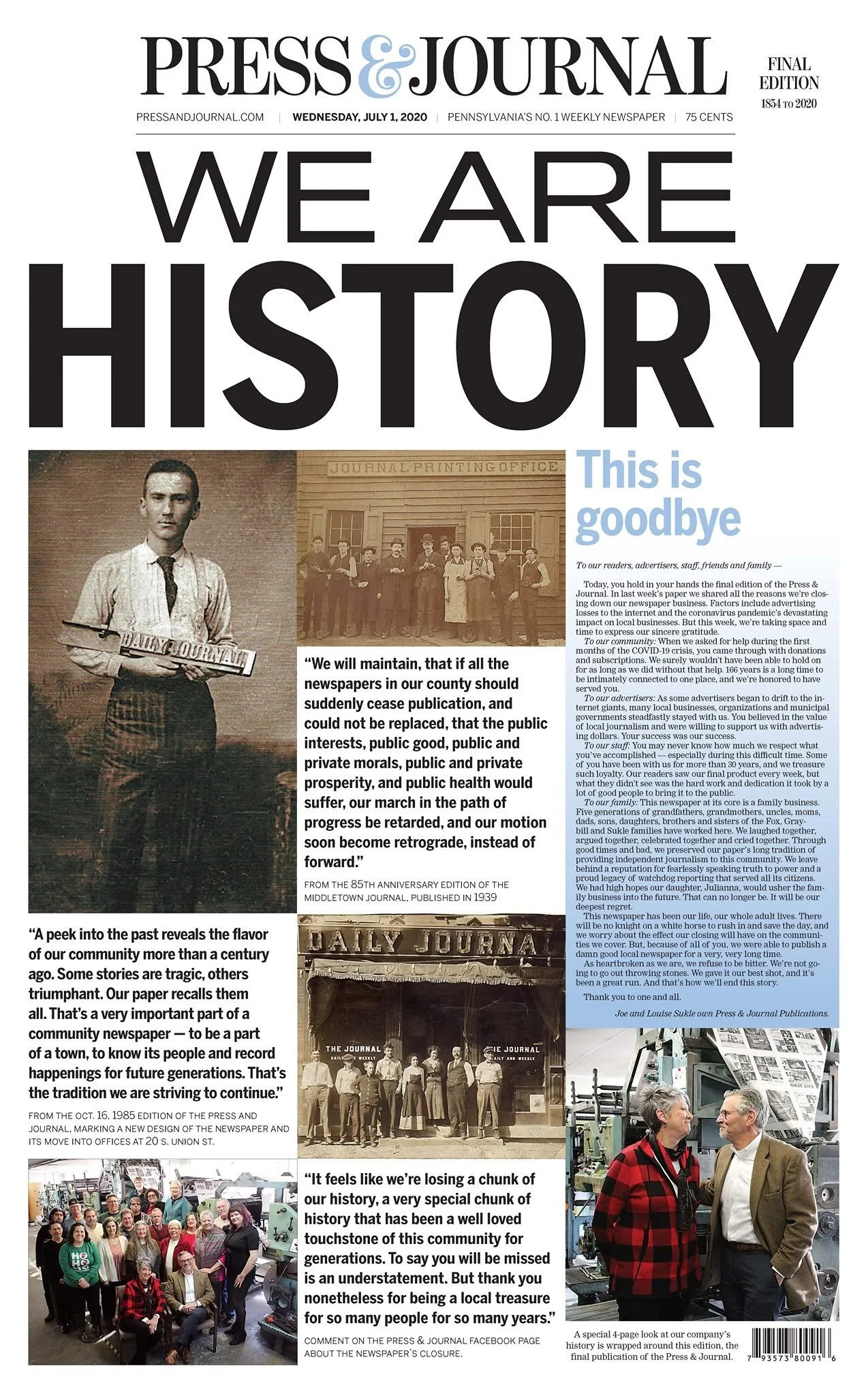
WHEN THE PUBLICATION BECAME HISTORYFor the final edition, the system stepped aside. After 166 years, the newspaper itself became the lead story, allowing a single idea, WE ARE HISTORY, to carry the front page.
PRINT FEATURE 01
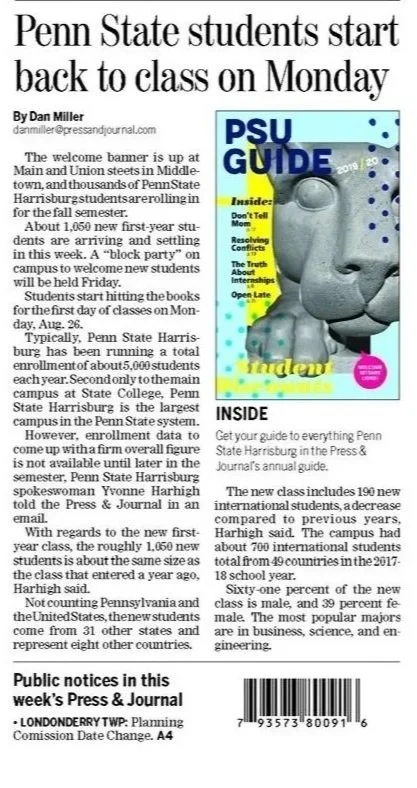
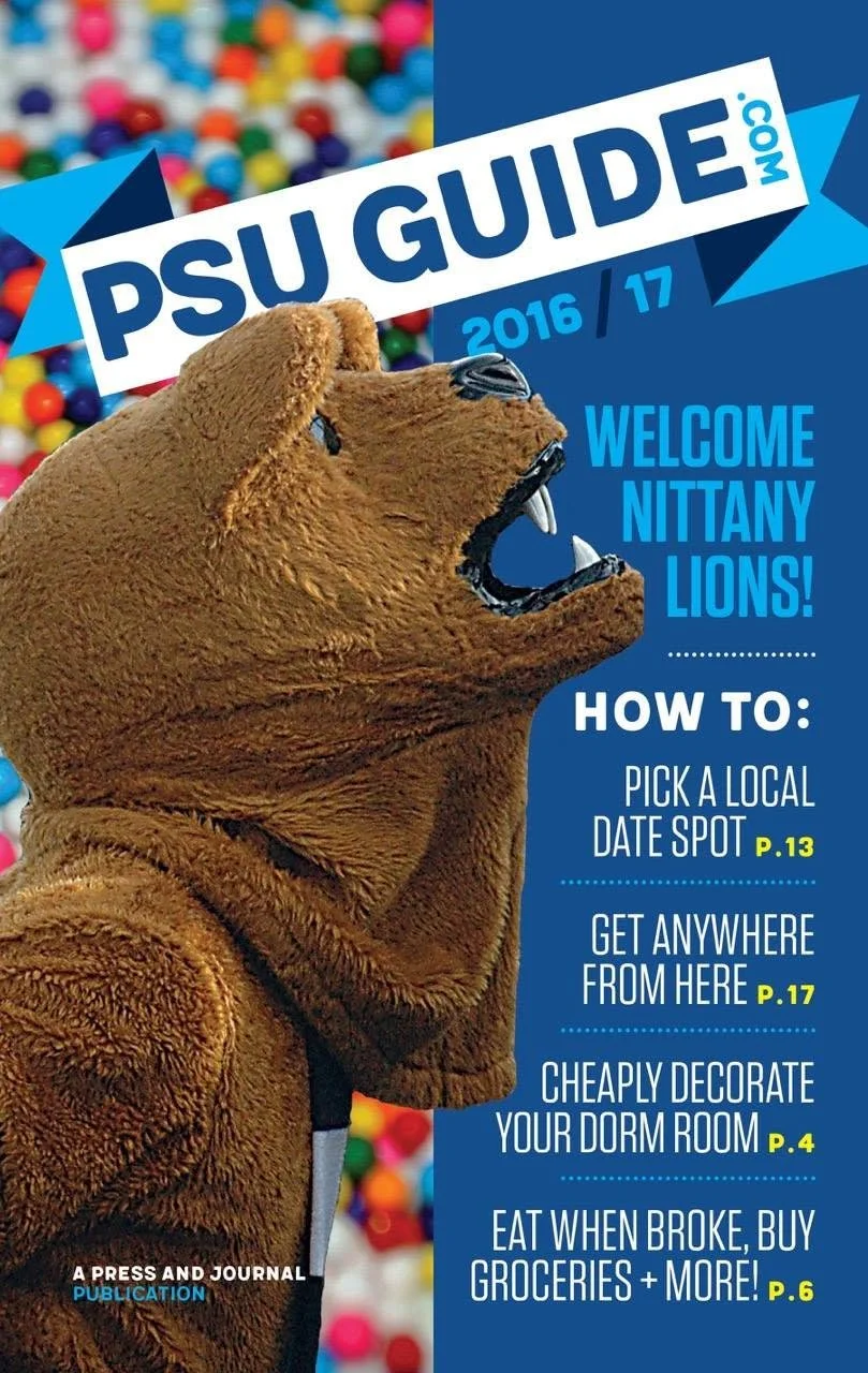
PSU GUIDEUseful enough to keep. Fun enough to read.
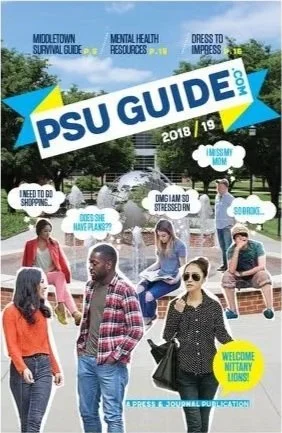
An annual editorial guide for Penn State Harrisburg students, created to turn practical local information into something with the energy, humor and visual attitude of student life.
CREATIVE DIRECTION / CONCEPT / DESIGN / EDITORIAL ART DIRECTION
-
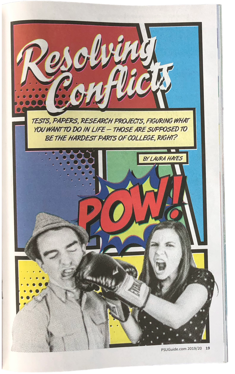
Make a service-oriented publication feel less institutional and more like something students would actually pick up, flip through and use.
-
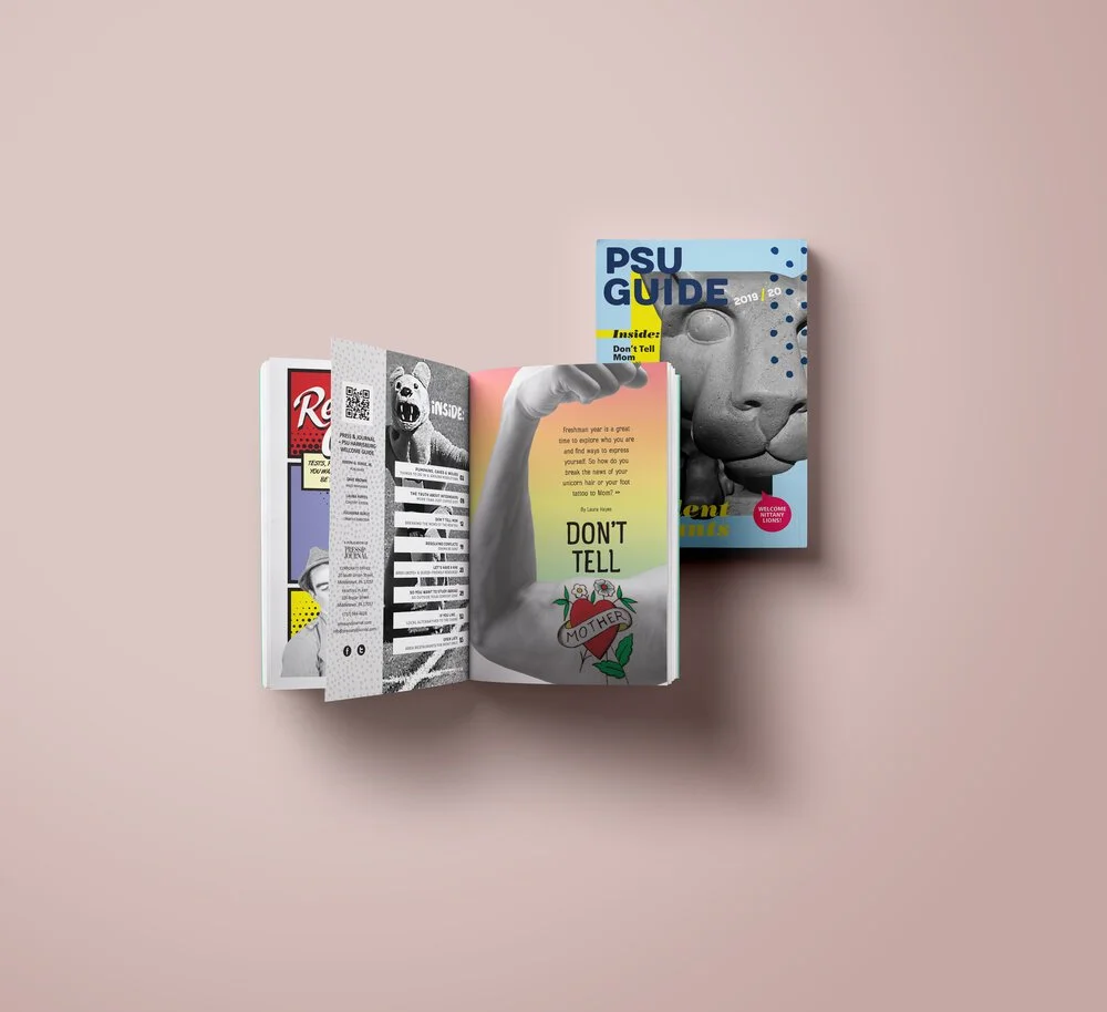
Bold typography, collage, bright color, irreverent imagery and a deliberately looser editorial voice gave the guide its own identity while allowing very different types of content to live comfortably together.
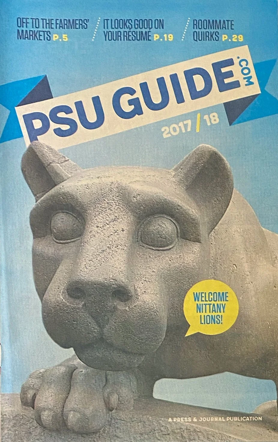
BUILT TO EVOLVEThe guide returned annually, giving the visual system room to change with each incoming class while retaining a recognizable voice and purpose.