IN PRINT
/
IN PRINT /
PRINT FEATURE 02
GUGGENHEIM UBS MAP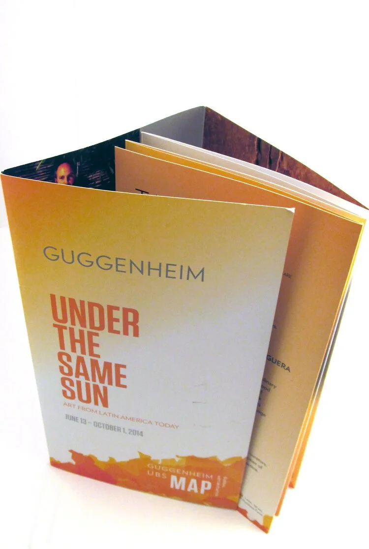
One exhibition. Many ways in.
UNDER THE SAME SUN: ART FROM LATIN AMERICA TODAY
Featured here: Under the Same Sun: Art from Latin America Today
The Guggenheim UBS MAP Global Art Initiative was a five-year international program developed to expand the museum’s engagement with artists, curators and educators across South and Southeast Asia, Latin America, the Middle East and North Africa.
For two consecutive phases of the initiative, I designed visitor and direct-mail publications that brought exhibition context, films, family programming, performances and public events together in a single editorial experience.
EDITORIAL DESIGN / ART DIRECTION / PUBLICATION ARCHITECTURE / IMAGE EDITING / PRINT PRODUCTION
THE FRAMEWORK
My role was to determine how that system would behave as a publication.
Johnson Banks established the Guggenheim UBS MAP identity, including the mark, typography, color palette and core artwork.
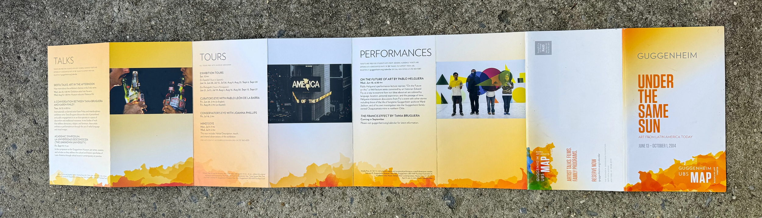
Working directly with Guggenheim teams, I set the page count, sequence and content placement, selected and cropped imagery, established hierarchy and shaped the source material into a piece that could be read, scanned and used in real time.
Publication unfolded / Under the Same Sun
THE VISUAL IDEA
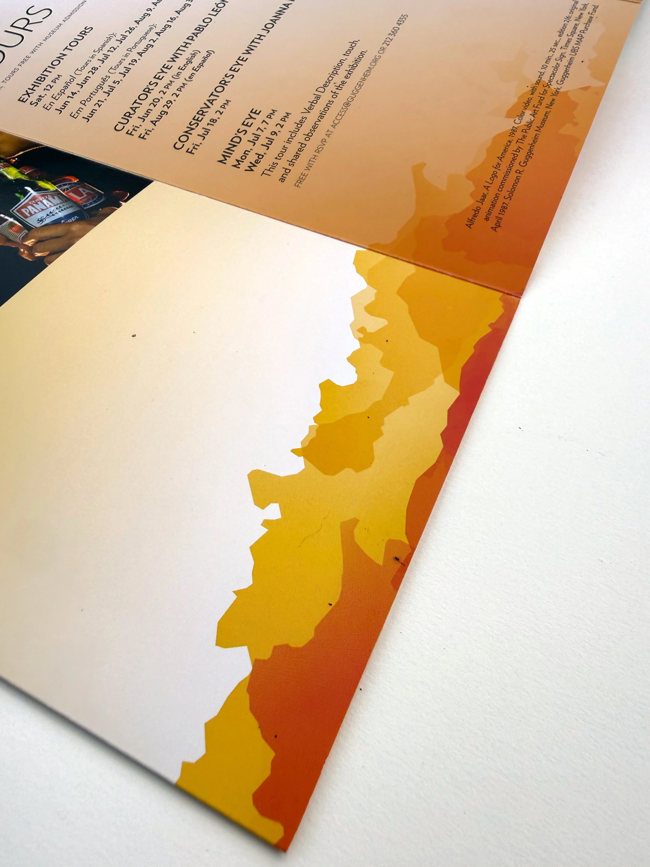
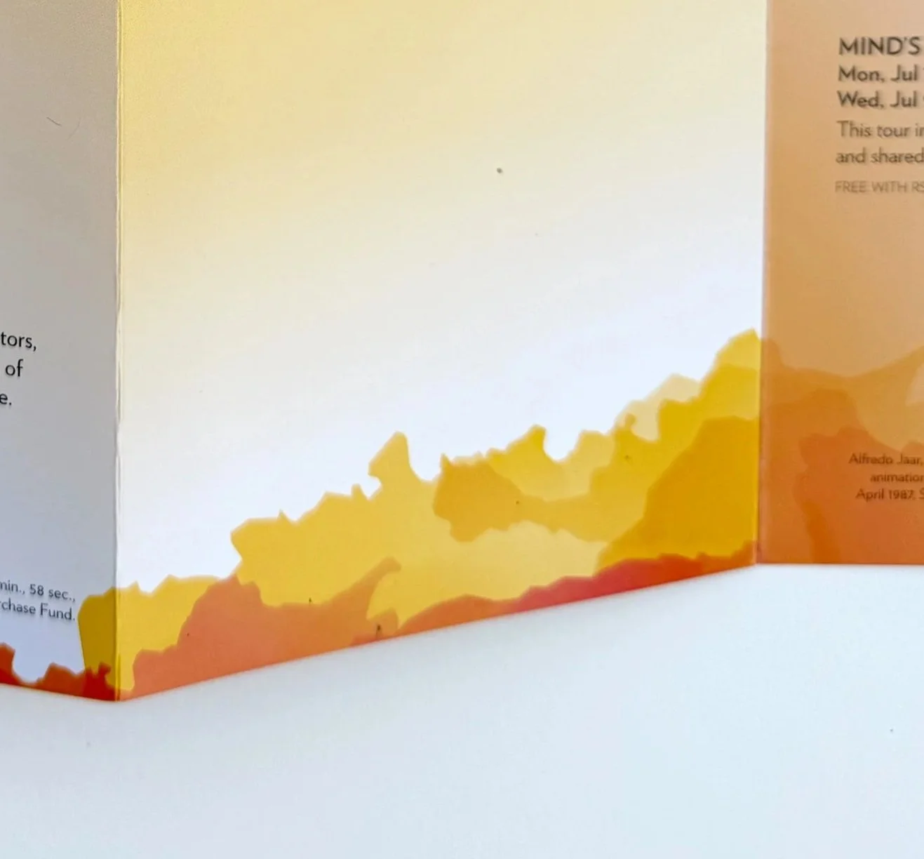
LET THE SHAPES BLOOM.The MAP identity used hard-edged, irregular forms derived from the participating countries. Rather than simply enlarging or repeating those shapes, I imagined them as drops of ink hitting water and blooming outward.
The softer, expanding treatment created contrast against the original geometry and introduced movement without departing from the established brand language.
THE EDITORIAL SYSTEM
The publication needed to hold very different kinds of information at once: exhibition interpretation, films, family programming, artist talks, performances and practical planning details.
I used scale, white space, image placement and modular page structures to give each content type its own rhythm while keeping the piece cohesive as a whole.
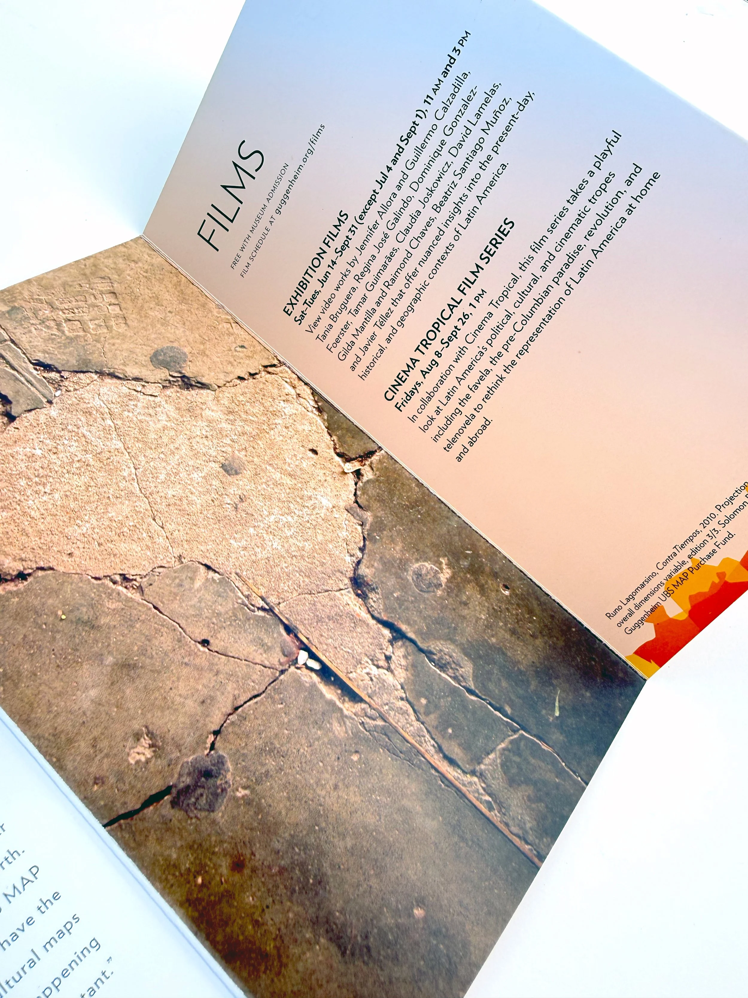
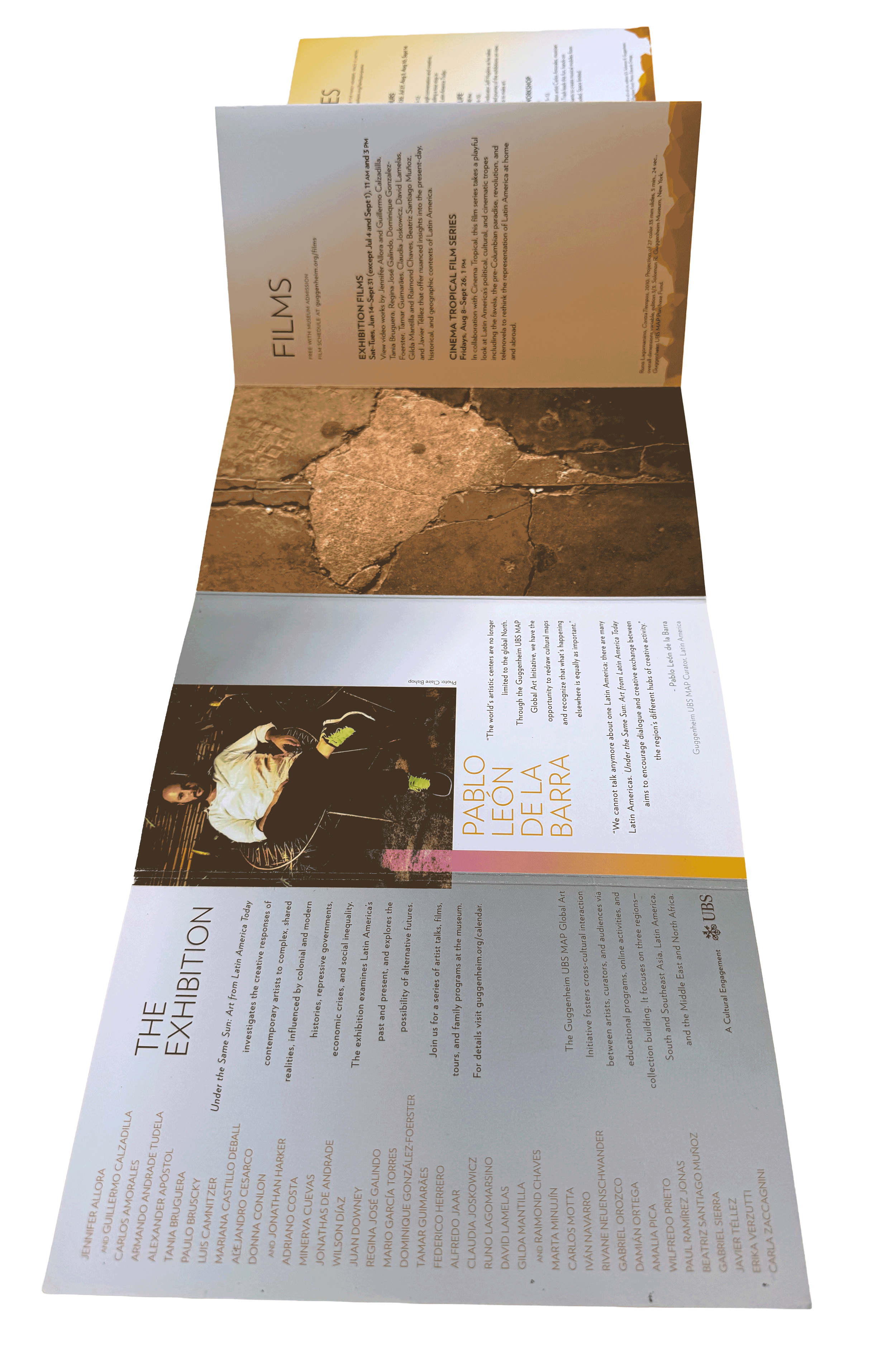
Structured enough to navigate.
Flexible enough to feel alive.
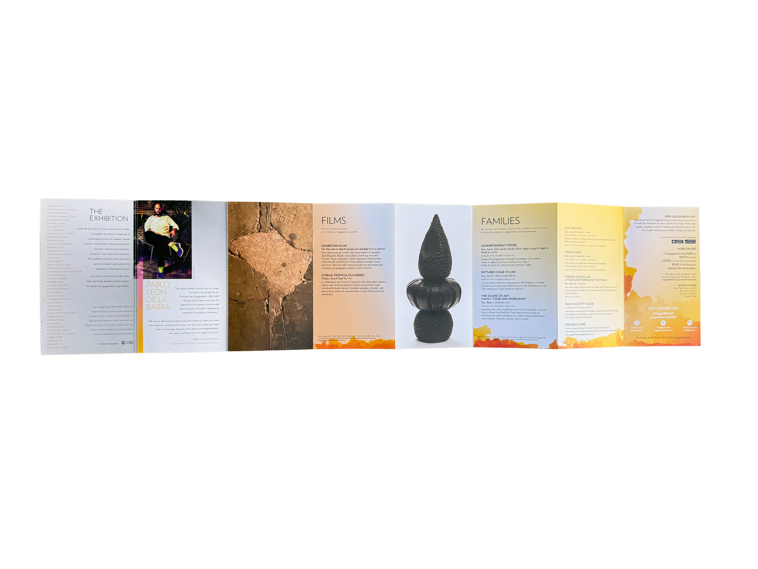
Made to travel.
Built to unfold.
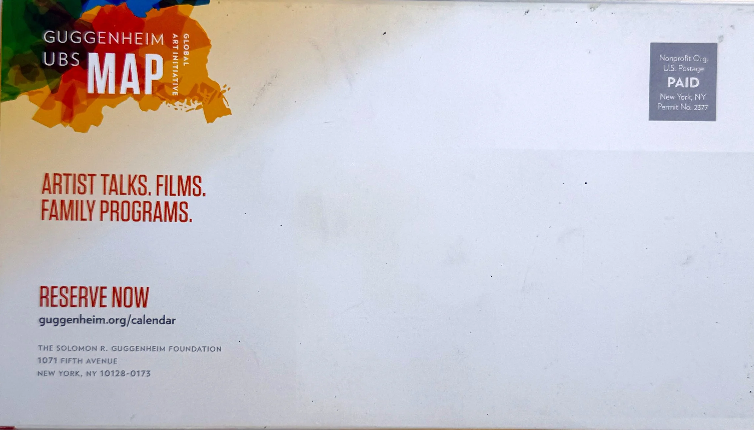
The piece was designed to function both as a visitor guide and as a direct-mail object. It needed to feel compact and clear in the mail, then expand into something more immersive once opened.
That dual purpose shaped decisions around folding, pacing, content density and how the visual system revealed itself panel by panel.
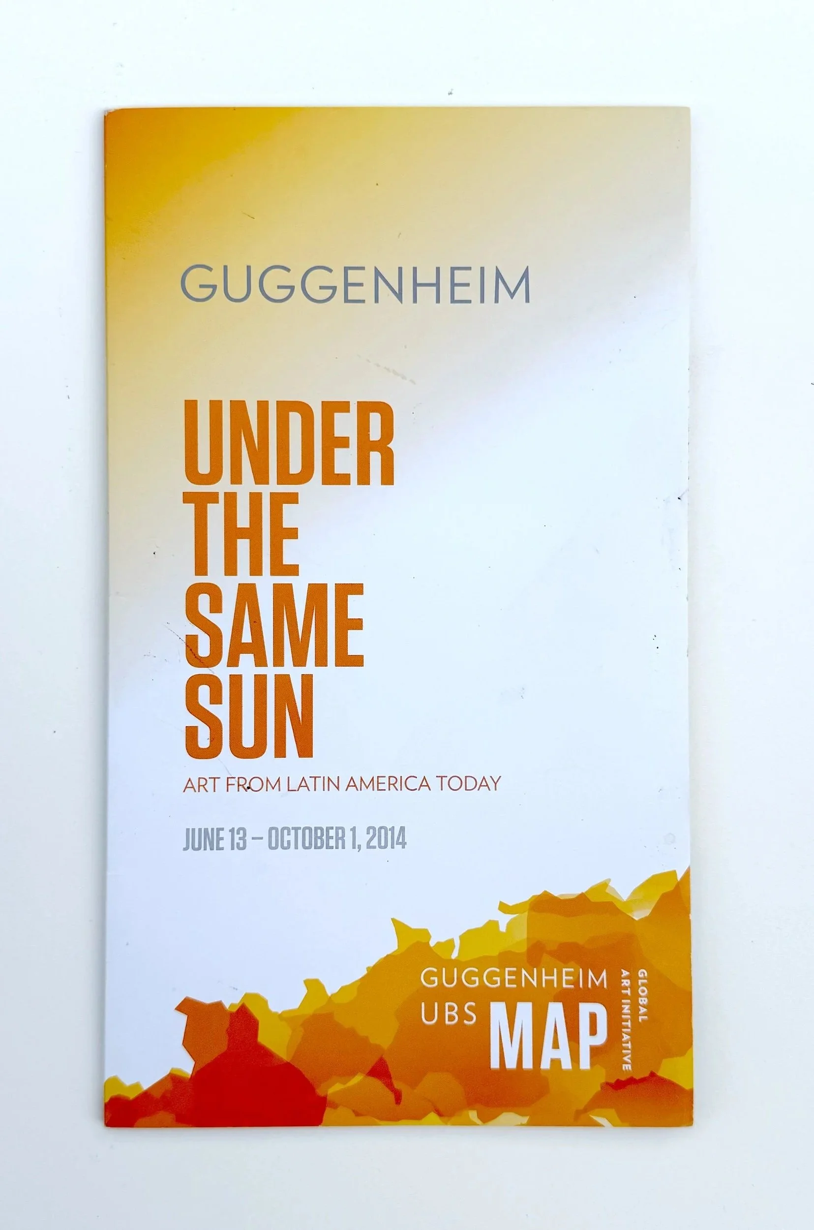
FROM SCREEN TO PRESS
I managed print production from initial quotes and vendor recommendation through final files and press check, ensuring the folds, color, image reproduction and finishing held up in both mailed and on-site use.
QUOTES / VENDOR RECOMMENDATION / FINAL FILES / PRESS CHECK
Two years. Two distinct experiences.
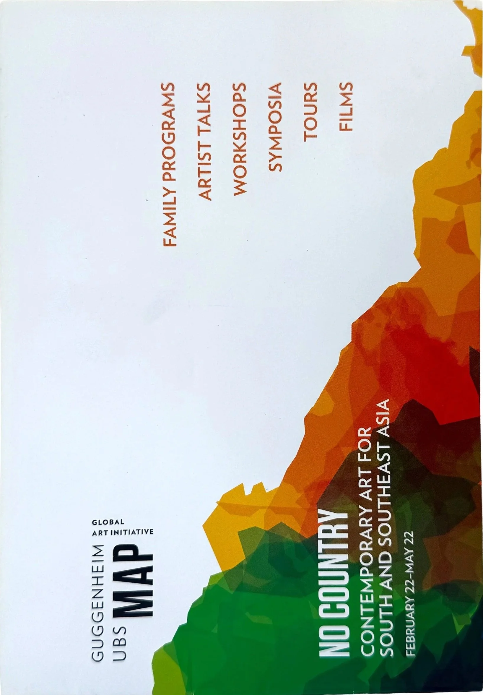
YEAR ONE / 2013
NO COUNTRY: CONTEMPORARY ART FOR SOUTH AND SOUTHEAST ASIA
February 22–May 22, 2013
Two consecutive installations.
One identity system.
Two distinct editorial treatments.
I designed the MAP visitor publications for two consecutive phases, allowing each installation to develop its own visual rhythm while remaining grounded in the larger identity.
PROJECT CREDITS
Editorial Design / Art Direction / Publication Architecture / Image Editing
Julianna Sukle
Brand Identity System
Johnson Banks
Client
Solomon R. Guggenheim Museum / UBS MAP Global Art Initiative
Print Production
Julianna Sukle
Featured Installation
Under the Same Sun: Art from Latin America Today
June 13–October 1, 2014